Here are some photographs of the details of the Queen Maud's 'mouse' portrait - Hover the mouse over the image to see the text details or click here to go to the paintings stats page.
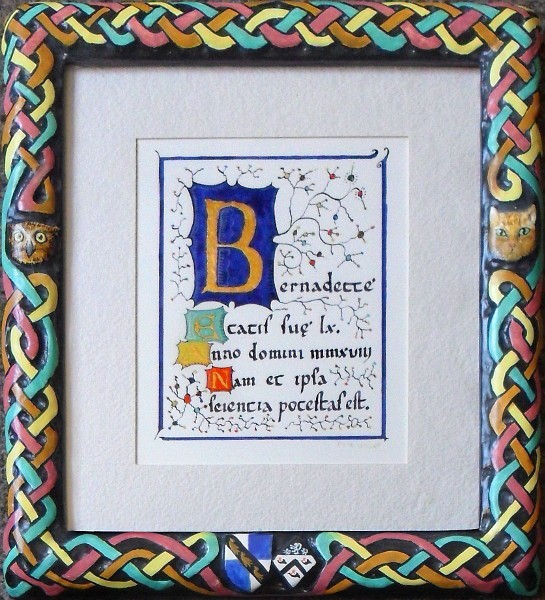 This is the script in its frame. The paper is special water colour paper that hasn't got any fluorescent brighteners in it and the floating mount hand made paper. The frame is an underpinned chop-service bare wood blank that has been hand-carved, sized, gessoed, painted and varnished.
The colours are detailed below but are all genuine and were available in Europe 600+ years ago.
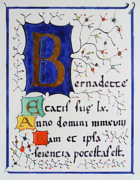 This is the illuminated text part with text and style that dates back to the Europe of over 600 years ago, as do
the pigments and the media.
The ink is iron gall ink which darkens as it ages over a few days as the iron in it turns from ferrous to ferric iron in the air.
The gold is 24k gold leaf gilded onto a medium of acacia honey, acacia gum, chalk and a tiny bit of red lead - this is not going to be sanded
at all so it is all right here. The red lead helps me to see where I have applied it and also makes for a warmer appearance for both the gold leaf
where it is - it is slightly transparent at this thickness - and also it takes the edge off the white background should there be any bits that end
up without gold that is thick enough.
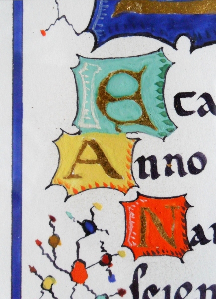 The pigments are:
- lapis lazuli for the blue (the shading is lamp black);
- malachite for the green (the shading is green earth or terre verte);
- lead-tin yellow ii for the yellow (the shading in minium or red lead); and,
- minium (read lead) with red bole for the shading.
In each case, the highlighting is lead white that I have made myself from lead sheet that has formed lead white over the last year.
The colours in the colour dots include the above colours along with rose madder and yellow ochre. All of the colours are the real thing and
there are no modern substitutions. The illuminated text is signed at the bottom right using lead white which fluoresces white in ultraviolet
light - the paper it is on does not so it forms quite a dark background for the glowing lettering in ultraviolet light.
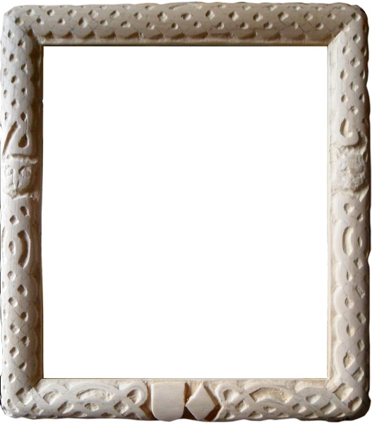 This is the partially carved frame, marked out with an insular design, animal faces and two coats of arms. You can see that the outside
corners have been planed down to an even curve and the insular weave goes around it towards the edge where appropriate.
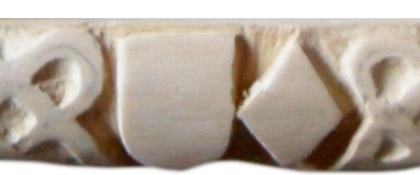 This is the partly carved pair of coats of arms close up. Coats of arms are organised as though viewed from the back - like a shield viewed
by the person carrying it. Where there are two, as in a married couple, the male goes on the carrier's right and the female goes on the left.
The male one is a shield that looks like the shape of a shield that would have been used in battle when heraldry started but women weren't
permitted to fight in battles so their coat of arms is placed instead on some other shape - for example, an ellipse or a diamond.
This represents an interesting problem in how you place the components of a different shape in it where you have, in this case, three lions
across the top of the regular shield.
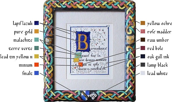 This is the final article showing you which pigments were used. With the exception of the gold and the size that was used under it, all of the
paints used on this were made using a traditional recipe that comprises of: pigment; acacia gum; acacia honey; and, water. These are mixed up
and cast into half pans from where they are used, like the solid blocks of water colour paints that you had in painting sets when you were a
child - except that these have lead-, copper-, cobalt- and tin-based pigments in them.
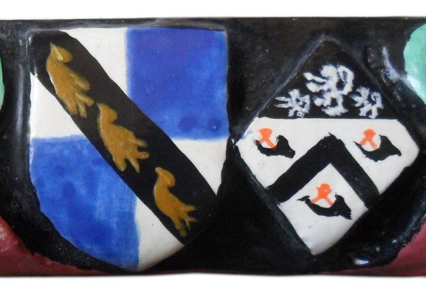 These are the coats of arms. To give you an idea of the size, the wooden moulding is only 31mm wide (top to bottom here as this is a rail).
The blue pigments used here is smalt which is ground up potassium cobalt glass. The bright orange is red lead or 'minium'. It might seem a bit
odd that such a bright orange is called 'red' but remember that the word 'orange' has only recently been used to describe that colour (since 1512).
Apart from red lead, things that are orange that are called 'red' include: red deer; robin redbreast; red fox; and, so on.
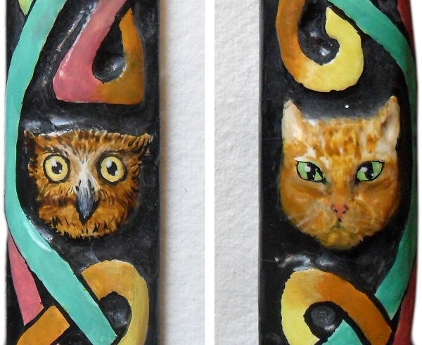 These are the two animals on the stiles. Again, these are all real traditional pigments mentioned in the image above. Here, the owl signifies
wisdom and the cat is a personal animal (which you might have gathered from the other paintings on this site).
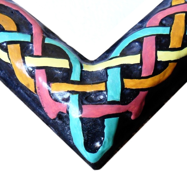 This is one of the corners (the bottom right) showing the insular, woven patten with barbs on the madder thread so that it stretches down the
side of the moulding slower as it approaches the corner.
All images and original artwork Copyright ©2015 Paul Alan Grosse.
 This is the script in its frame. The paper is special water colour paper that hasn't got any fluorescent brighteners in it and the floating mount hand made paper. The frame is an underpinned chop-service bare wood blank that has been hand-carved, sized, gessoed, painted and varnished.
 This is the illuminated text part with text and style that dates back to the Europe of over 600 years ago, as do
the pigments and the media.
 The pigments are:
 This is the partially carved frame, marked out with an insular design, animal faces and two coats of arms. You can see that the outside
corners have been planed down to an even curve and the insular weave goes around it towards the edge where appropriate.
 This is the partly carved pair of coats of arms close up. Coats of arms are organised as though viewed from the back - like a shield viewed
by the person carrying it. Where there are two, as in a married couple, the male goes on the carrier's right and the female goes on the left.
 This is the final article showing you which pigments were used. With the exception of the gold and the size that was used under it, all of the
paints used on this were made using a traditional recipe that comprises of: pigment; acacia gum; acacia honey; and, water. These are mixed up
and cast into half pans from where they are used, like the solid blocks of water colour paints that you had in painting sets when you were a
child - except that these have lead-, copper-, cobalt- and tin-based pigments in them.
 These are the coats of arms. To give you an idea of the size, the wooden moulding is only 31mm wide (top to bottom here as this is a rail).
 These are the two animals on the stiles. Again, these are all real traditional pigments mentioned in the image above. Here, the owl signifies
wisdom and the cat is a personal animal (which you might have gathered from the other paintings on this site).
 This is one of the corners (the bottom right) showing the insular, woven patten with barbs on the madder thread so that it stretches down the
side of the moulding slower as it approaches the corner.