 |
|
 |
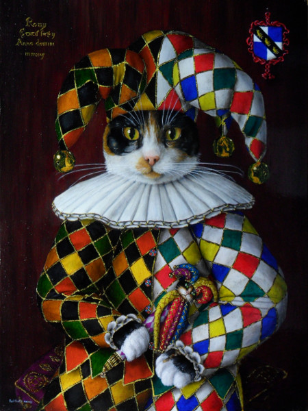
| This is the whole painting - 300mmx400mm, oils on Italian poplar wooden panel. |
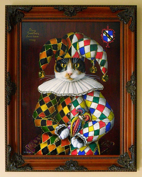
And this is it in its frame - a walnut swept frame. |
 |
 |
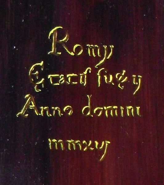
'Romy - Ætatis Suæ ij - Anno Domini mmxvj' (Romy - aged 2 - the year 2016).
The painting was started in 2016 - hence the date for the subject - although it was finished in 2017. These can and do take months to paint. |
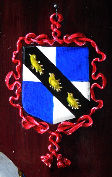
The Grosse coat of arms. |
 |
 |
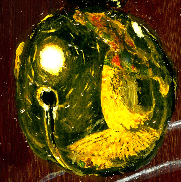
| One of the bells on Romy's headdress. Each one of these sees the world from its own point of view and here, you can see the reflection of the main light source - together with the secondary light source on the upper right - along with reflections of the headdress with the coloured diamonds of the harlequin pattern. Note that the red and green diamonds look red and green but yellow and white look the same and blue (on the bells on the other side) looks green. Note that the scratches on the surface of the bell pick up the highlight only when they run across any imaginary radial line from the light source. |
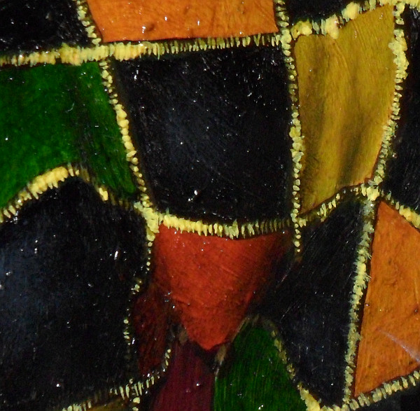
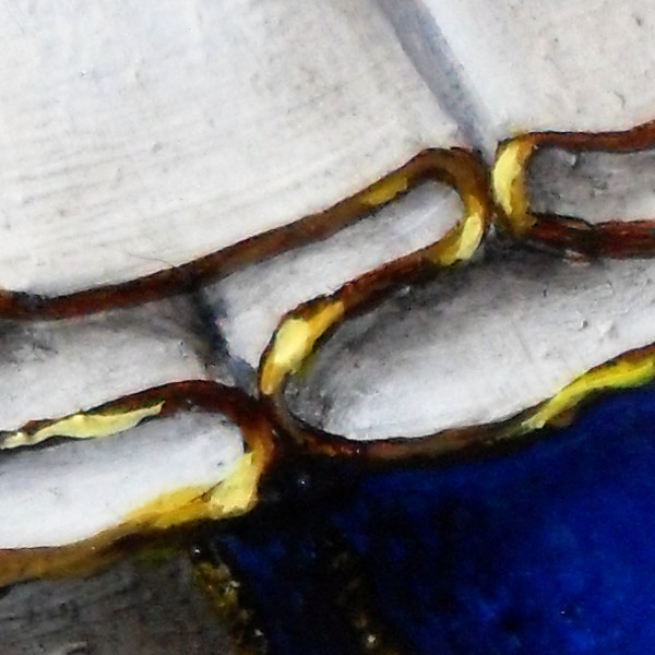
These are the folds and undulations in the cloth of the headdress. Apart from distorting where the gold-thread-sewn borders of each diamond sits, they also show shadows that the Dutch method of painting allows reproduces excellently. A grey layer - the density of which is not the same as in a black and white photograph but instead, the same as the 'Key' layer in an CMYK separation (modified for the colours used instead of theoretically perfect CMY colours - remember, we are using Indian Yellow and Sap Green here, amongst other colours) so that when you paint your glaze over it, it appears to be inshadow. This is far superior to puttingit all down in one, using opaque media (alla prima). |
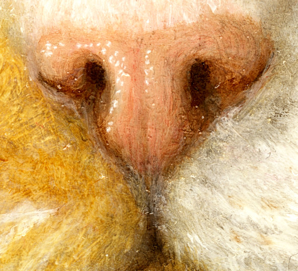 |
Above:
Romy's little nose - painted using lead white (PW1, lead carbonate/hydroxide), Naples yellow deep (PBr24, chromium antimony titanate) and permanent rose (PV19, quinacridone violet) with Burnt Umber (PBr7, iron oxide) for the shadows and a little ivory black (carbon) for the deaper shadows, finished off with some a rose madder (NR9, alizarin and purpurin) glaze applied appropriately to get the final colour right. |
|
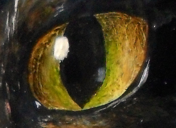
Above-right:
Romy's left eye. This is done again, with a monochrome layer with glazes over the top. Finally, a blocking titanium white rectangle is placed on it for the hightligh - eliminating anything that is underneath and when that is dry, flake white is painted over the top of that to make a softer highlight that is more comensurate with the appearence of the rest of the painting. |
|
| |
Right:
The gold trim on the ruff - showing how the gold is made up of predominently brown then with a 50:50 mixture of brown and yellow ochre and then yellow ochre with a little white in it for the highlights. If you look at real gold - not something that is merely gold coloured - you will notice that the highlights are never white unless the angle of reflection is extremely shallow. This is because the valence electrons on the surface of the gold absorb blue light - given half a chance - so even bright lights are filted by the reflective surface.
Note that there is no actual gold here, just paint pigments. |
|
 |
 |
 |
 |
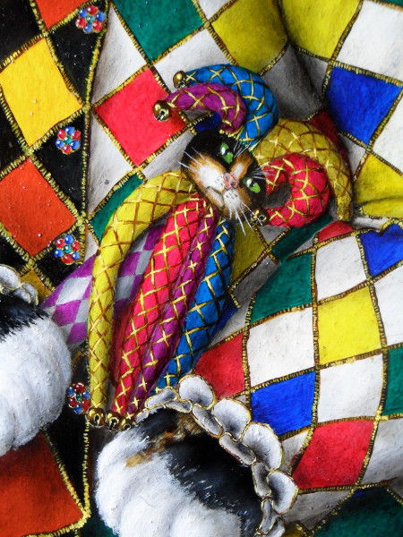
| Romy's Jester Sceptre toy, complete with golden bells on the ends. Note also, the buttons of here tunic are each made from an emerald, three rubys and three sapphires, cabochon-cut, all mounted in gold. Also, you can see the the cuff-ruffs are trimmed with gold. |
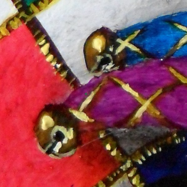
Close-up of the golden bells at the ends of the 'protrusions' on the toy's headdress. |
 |
 |
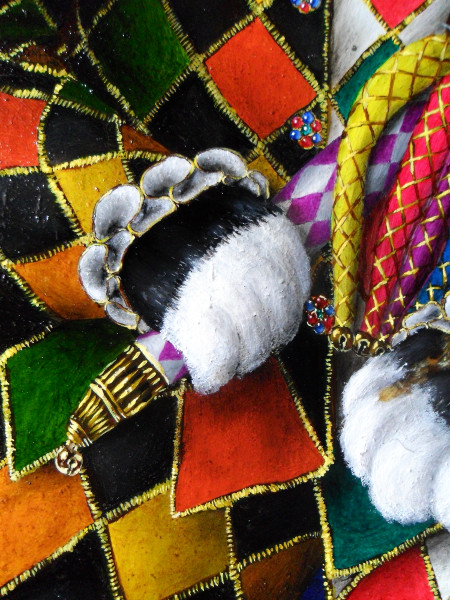
| Romy's little black and white paw holding the sceptre which is in white and violet with a gold and and, of course, a golden bell. Also note the zig-zag bottom of the tunic. |
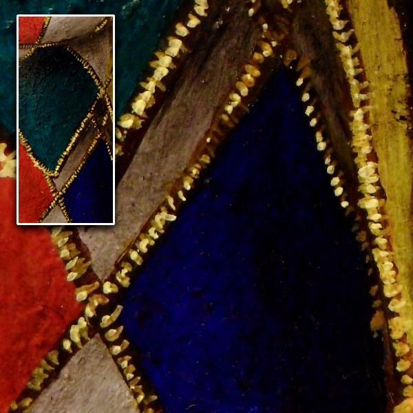
This is the tunic on the other side, under the sleeve, showing how the gold threading is painted and how dark the colours get when they are in shadow.. |
| Design: |
 |
|
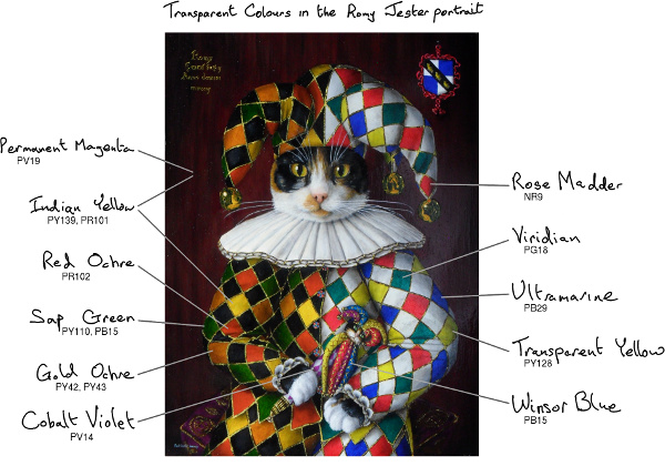 |
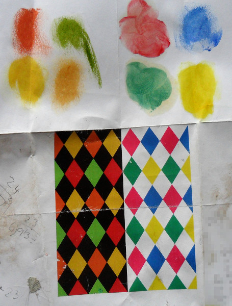
| The colours for the diamonds in the harlequin have to come from somewhere and when using the Dutch method of putting down a layer of grey - effectively doing a monochrome version of the painting (grisaille) - and then painting layers of coloured glaze over the top, the subset of your palette that you can use is limited to the transparent and semi-transparent colours (Here, 'limited' isn't that much of a problem). So, having selected a 'yellow' set to go with the black background and a 'blue' set to go with the white background, I needed to work out the best way of organising them so that colours didn't clash and it all looked harmonised. On the computer, using 'The GIMP' software on my Linux PC (it will run on virtually any OS if you want to use it for free yourself), I set about playing around with the colours until I came up with the image above. Above that, you can see the pigments that I used. |
Here, you can see which transparent pigments I used, including the top glaze for the wood background. |
 |
 |
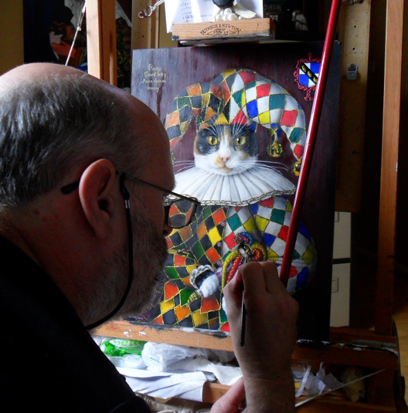
| This gives you an idea of the scale of the painting. With a panel size of 300mm x 400mm, details painted with a '000' brush are still quite fine (unlike in the 'Bella' miniature which is only 73mm x 99mm) and as a result there is a lot of work in the painting and from beginning to end, it took almost half a year. |
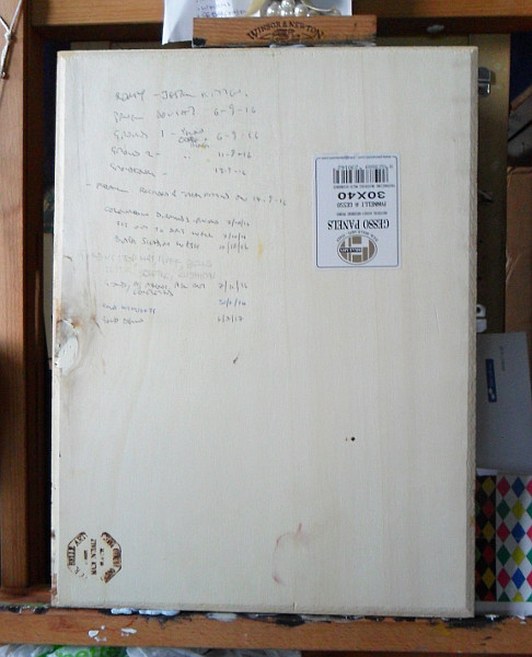
Here is the back - it is actually Italian poplar plywood that has had Gesso applied to it and then sanded, that process being repeated so that there are three layers of gesso and a very smooth, flat surface that normal stiff oil painting brushes do not work on properly at a small scale.. |
| Ultra-Violet False Colour: |
| Finally... |
 |
|
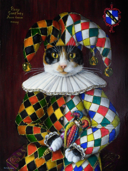 |
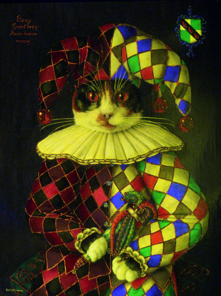
| This (left) is an Ultra-Violet False-Colour (UVFC) image of the painting. The painting was illuminated with ultraviolet light which made the rose madder fluoresce orange. For the purposes of this image, the orange was then represented as blue with the blue and green layers in the normal image (right) being shifted down to green and red respectively, with the original red layer being discarded in order to produce the image above. |