UV-Vis-IR - Exploring paintings in a different light
We are all used to seeing photographic reproductions of paintings in books where the images have been broken down into red, green and blue bands so that they can be reproduced using cyan, magenta and yellow dyes with black as a 'key' (CYMK) (to take up the deficiencies in the dyes used) but real paintings aren't limited to three colour bands, they use pigments and laked dyes that change their absorption of light between wavelengths in different places. Not only that but their absorption properties extend beyond the visible range, into infrared and ultraviolet with the latter, having enough energy to make some colours, as well as the oil medium itself, fluoresce. By looking at these, we can extend our understanding of how a painting was created by the artist and unlike many paintings that this is done to, I know what has happened because I was the one that painted it.
With Your Own Eyes
The light that we see reflected by a painting is only a small part of the spectrum that our oil paintings respond to. |
 |
|
 |
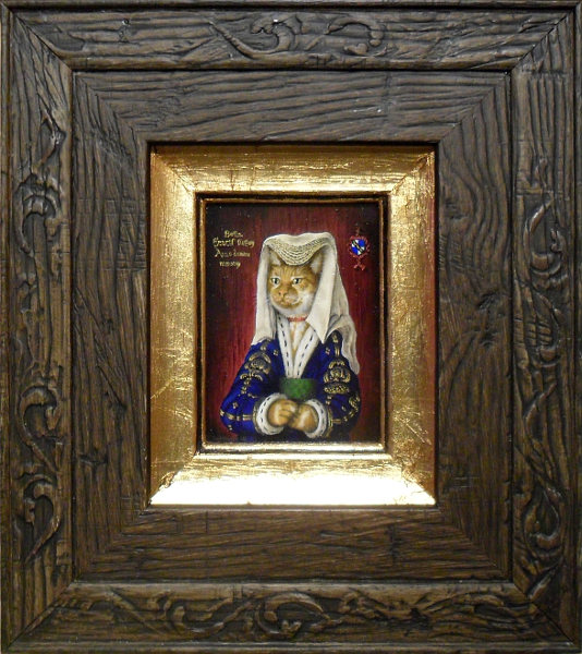
The whole painting -
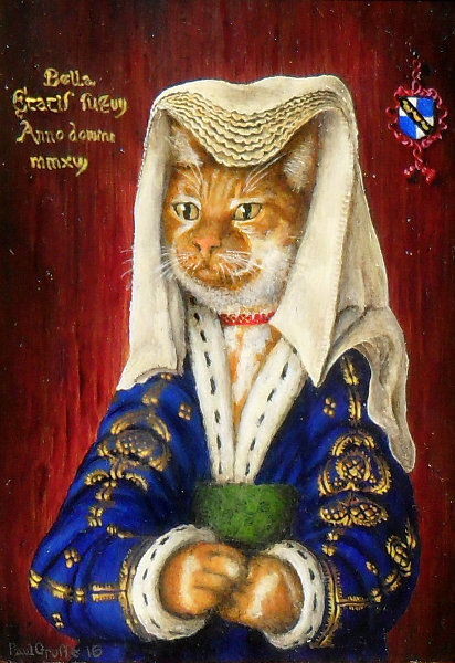
'Bella' - Ætatis Suæ vij. Anno domini mmxvj (Age seven, 2016AD) - Ginger and white female cat (unusual as ginger cats are almost always male although she does have quite a cobby face for a female) wearing traditional 15th century Netherlands headdress and blue and gold brocade top with white fir and ermine trim to cuffs and collar.
All of the photographs on this page, including the photograph above were taken with a Samsung ES71, a typical compact digital 12Mp camera, the equivalent of which, you can buy fairly cheaply in any town - I got mine for around £80 in 2010 so they should cost less than that now. |
|
If you look beyond the red, to longer wavelengths (Infrared - IR), you start to get some interesting interactions with major differences between earth pigments (such as ochres) and transparent colours such as Ultramarine, Magenta and Indian Yellow. These can be picked up with a medium-priced, point-and-shoot camera with the right filters
When going beyond the blue, into ultraviolet (UV), the energy of the light becomes high enough for some colours to fluoresce in the visible range which can then be picked up with the camera.
|
The idea here is that you can experiment and produce all of these images yourself using things you can pick up fairly cheaply in your local photography store or on the Internet so I'm not going to delve into longer wavelength IR or special equipment. Have a go yourself and have some fun.
|
|
With the Camera under Normal Circumstances
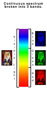
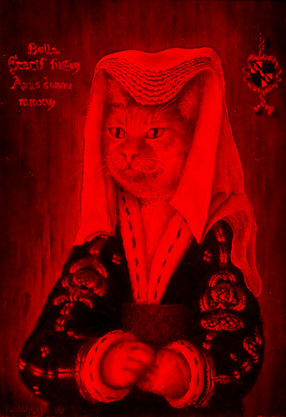
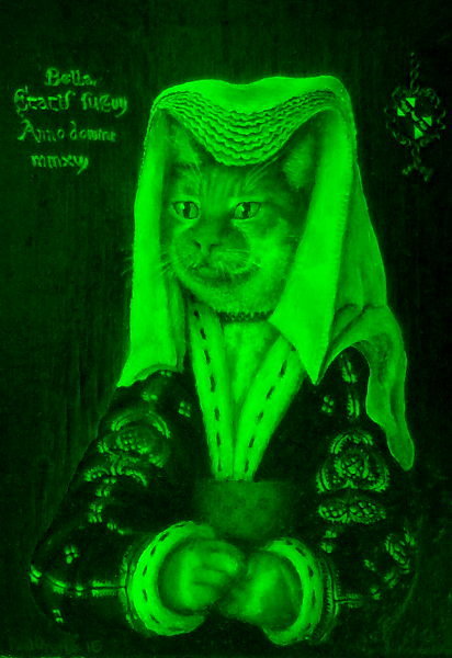
The camera uses three filters to break the image down into three layers - the colours of which correspond broadly with the colours of the receptors in your eyes. |
 |
 |
|
 |
|
 |
| |
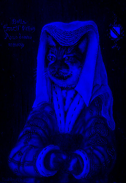
Red layer. |
Green layer. |
Blue layer. |
By adding together the values from these three layers, a colour image is formed that we can recognise as being fiarly close to the original.
Of course, the camera isn't limited to red, greena dn blue, it can also see infrared and we can also shine ultraviolet light at it as well and see what happens then.
Also, the convention that what is presented as the red layer originated as a band of light that covers 'red' in the original object and lighting conditions - extended to green for green and blue for blue. So, let us experiment...
|
|
Extending the camera's sight into the Infrared (IR)
Our eyes are actually sensitive to some infrared - down to around 780nm - I tried this myself with a spectrophotometer in the analytical laboratory that I worked in in the 1970's. The light levels are necessarily low (in order to prevent non-liniearities in absorption) and so are safe in the visible and near IR.
IR sensitivity in the camera is largely filtered out because vegetation reflects a lot of it and you start to get weird results if you don't do something about it. However, there is still some sentivity left and with an infrared-passing filter, you can make sure that the only light your camera sees is IR and it adjusts the exposure accordingly.
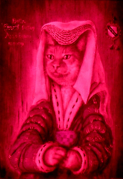
For these experiments, I used a filter that cuts off at around 760nm so it appears black or very dark red to the naked eye. Between 760nm and the wavelength where the camera's sensor stops working - somewhere in the order of 900nm or 1,000nm - there is enough bandwidth and difference in sensitivity of the camera's RGB filters to get some differences related to IR colours - these manifesting themselves as changes in hue.
Below, you can see the images just from the IR and there is very little difference in response between the layers in the IR range.
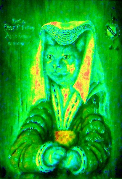
Because there is some difference however, you can expand the hue range to get a false colour image, electronically, using an image editor program such as the very capable, cross-platform editor 'The GIMP'. The GIMP is the program used to do all of the image editing on this page and will just cost you the download time as it is free of charge.
|
| |
 |
|
 |
|
| Raw Infrared image. |
Same image with hues expanded. |
|
So, there isn't a great deal of difference in hue within the IR band although it can be expanded if required.
It would be nice if we could see other differences and at least from the expanded hue image above, one thing that our eyes are very sensitive to is a change of hue.
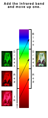
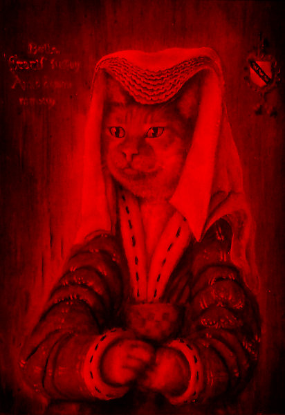
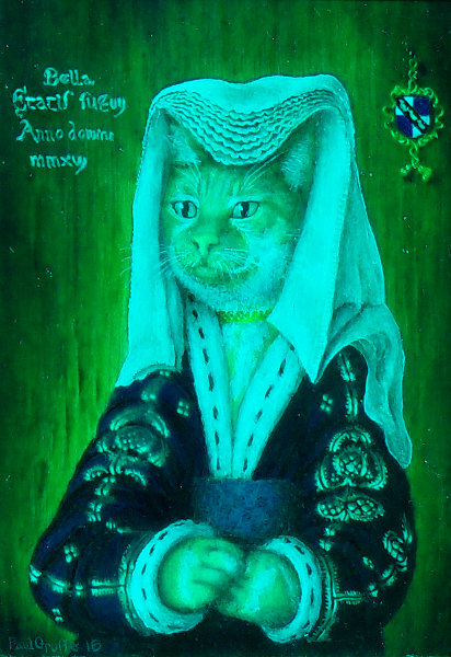
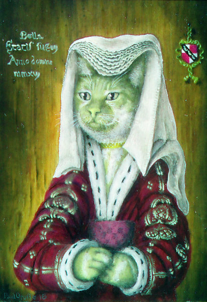
One way of tying in a change of hue to parts of the image that we can easily recognise is to use the IR information, condensed down into one layer, along with two of the existing layers and being infrared, it would make more sense to do it with the adjacent red and green layers. Below, you can see how the IR information is used as the red layer and the other two are transposed up to make green and blue.
|
 |
 |
|
 |
|
 |
| |
Infrared image that has been desaturated then just the red layer is used. |
Visible with blue removed then shifted up a band so that green becomes blue and red becomes green. |
IR,R,G composite (adding the two images on the left) presented as an RGB image (IRFC). |
|
Illuminating the image with higher energy Ultraviolet
Unlike infrared, ultraviolet has some interesting properties simply because it has more energy.
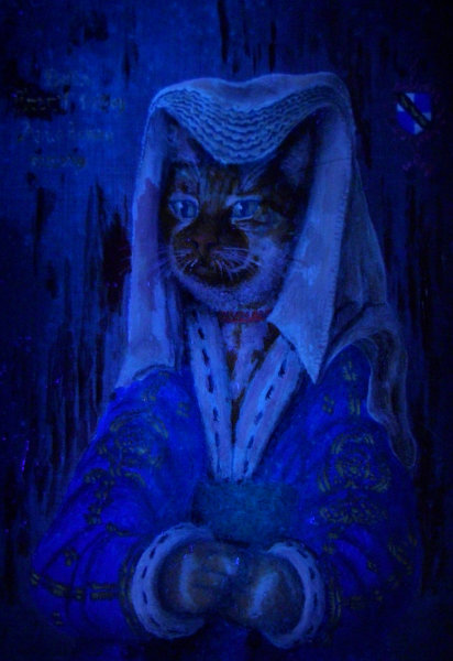
If ultraviolet light is absorbed by a pigment, it can be re-emitted at a lower energy which we see as fluorescence (UVF). If you have ever played about with a UV lamp by shining it on a driver's licence, bank notes or cheques, you will notice that there are patterns there that would otherwise be invisible. With oil paintings, there is the same thing going on although in this case, we are using fluorescence to gain information about how a painting has been made.
|
 |
|
 |
|
 |
| The original painting. |
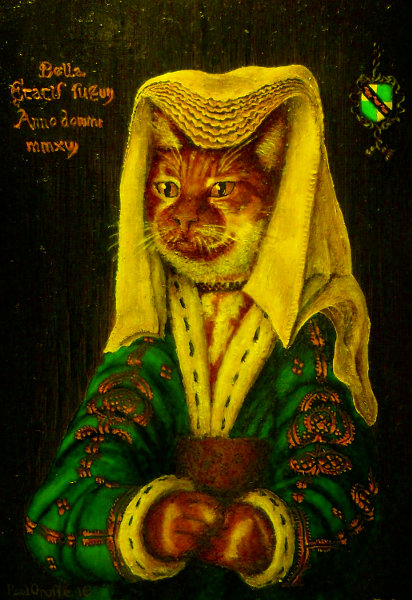
Shining UV light on the painting produces this image - there are various areas that look the same as their surroundings in the original but are darker in the image above. |
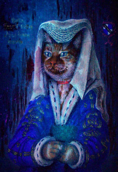
This is the UVF image on the left but the separate RGB layers have been normalised to make them easier to see. One thing to be aware of here is that where an area has been glazed - opaque medium layer covered by a transparent coloured layer - the UV light can shine through the glaze (as it does with the ultramarine blue) and make the opaque layer fluoresce (as with the zinc that Winsor and Newton add to their titanium white) which then goes back through the glaze which colours it - in this case, blue. |
With the normalised image, you can see that:
- areas of the headdress are made from pigments that fluoresce with two different colours;
- the gold highlights fluoresce yellow; and,
- the wooden background has dark areas in it.
Read on to find out why this is.
|
|
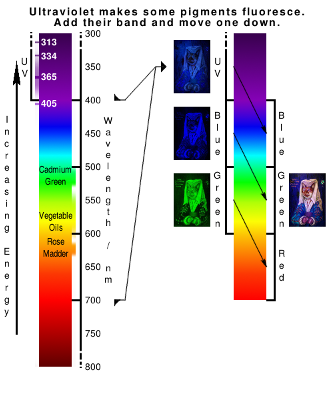
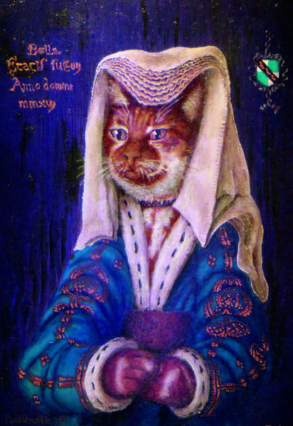
As with the Inrfared False Colour (IRFC) image we produced above, you can also do the same with UV to make a UVFC image which, like the IRFC, can tell you things you might not otherwise have noticed.
|
 |
 |
|
 |
|
 |
| |
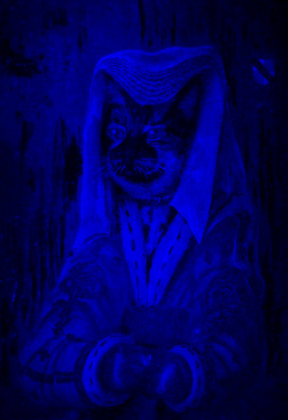
Blue layer from the desaturated UVF image. |
Visible with red removed then shifted down a band so that green becomes red and blue becomes green. |
UVF,B,G composite (adding the two images on the left) presented as an RGB image (UVFC). |
|
Now, we have three images
Here they are, next to each other... |
 |
|
 |
|
 |
| IRFC |
Normal |
UVFC |
Note how the ginger fur is quite pale in the IRFC image and gets deeper as the RGB channels move upwards. This is because the iron oxide that is used in that type of pigment absorbs light increasingly as it goes towards blue.
Also, note that the blue ultramarine absorbs green and red light - as you would expect - but that it transmits enough infrared to appear a deep red on the IRFC image.
Another thing to kee an eye on is the blue squares in the coat of arms.
|
|
So far, we have talked about colour bands
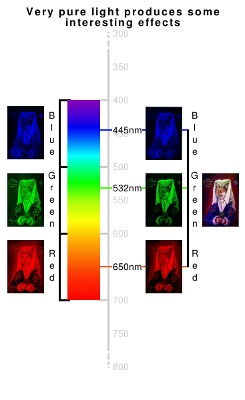
LEDs, whether they are lasers or other devices care capable of producing light that has a much narrower band of wavelengths. so colours that absoarb across most of the spectrum will look different to those that absorb narrowly - either with the laser wavelength coinciding with high levels of absorbtion or reflection.
In addition to this, it produces light that is all in phase - it can only do this if it is at the same wavelength and as a result interferance spots occur.
|
 |
 |
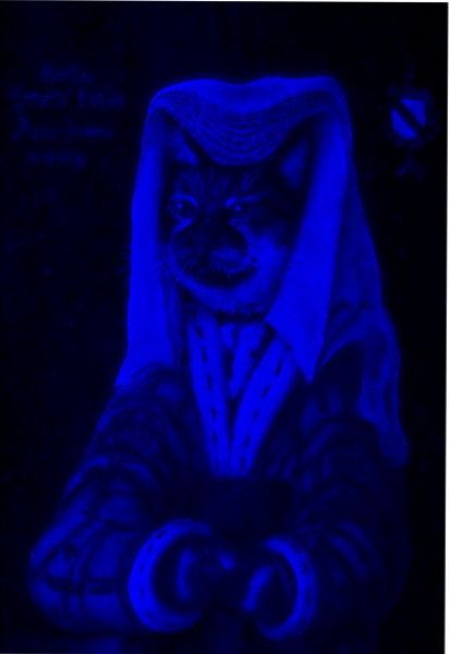
Firstly, the blue light source used to take the image on the right comes from an InGaN (indium gallium nitride) LED that was part of a cheap cigarette lighter. It emits light at wavelengths between 445nm and 450nm which is a band that is only a twentieth of the nominal blue band of 400-500nm.
On the left, is the blue channel from the camera and on the right, the result of the same image but from the LED pointed at a white paper target that then shines on the picture, illuminating it fairly evenly.
There are a number of differences between the two images: The blue layer image on the left takes in light from all of the blue band whigh includes the lower end of it and therefore, in the image on the right, the ochres in the goldon the sleeves appers almost black. Additionally, the ultramarine is quite transparent at this wavelength and so you can see the black underpainting/sketching in the sleeves. |
 |
| 500nm-400nm filtered |
445nm InGaN LED |
 |
The workings of a green laser is a technological feast that is better described by the likes of Wikipedia than me here but they are common enough for you to pick them up online quite cheaply.
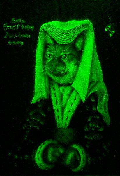
On the left, you can see the green channel from the camera and on the right, the result of the same image captured by shining a 532nm green laser pointer at a white paper target that then shines on the picture, illuminating it fairly evenly.
There are a number of differences between the two images: The green layer image on the left takes in light from all of the green band - from roughly 600nm up to 500nm - and this includes the oranges and yellows of the ochres that make up the gold in the brocade. The laser image, however only takes from the colder green light at 532nm and so the gold part of the brocade is substantially darker in this image - this also applying to the gold lettering and the ginger fur.
Also, the red ribbon around the coat of arms is substantially darker in the laser image - it reflects light at the bottom of the green band but not as far up as 532nm. |
 |
| 600nm-500nm filtered |
532nm DPSSFD laser |
 |
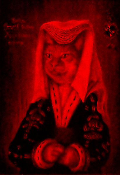
Here, the green belt is substantialy darker in the laser image than it is in the full band image - pretty much for the same reasons - the broad red band, going up to around 600nm, picks up some of the light reflected from the green belt but by the time you get down to 650nm, there is hardly anything there to see. |
 |
| 700nm-600nm filtered |
650nm GaInP laser |
In effect, the laser light produces a response from the camera that is akin to an 'ultra-fine filter' being placed over the lens.
Note that in the laser images, there are a lot of speckles of light. This is because laser light has special properties that affect the way that it behaves when it is refracted or reflected (or even goes near to something). The quality of the blue image is so poor because the auto-fucussing is 'distracted' and doesn't work properly under these conditions (which is where a more expensive camera with manual focussing would come into its own, although that would be outside the brief of this project).
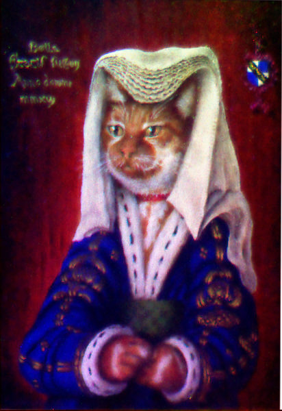
We do now have three images (650nm+532nm+445nm as opposed to R+G+B) so we can make a colour composite - more out of curiosity than anything else...
|
 |
 |
| Normal Visible range image |
Composite of laser/LED light source images. |
|
|
Armed with this knowledge
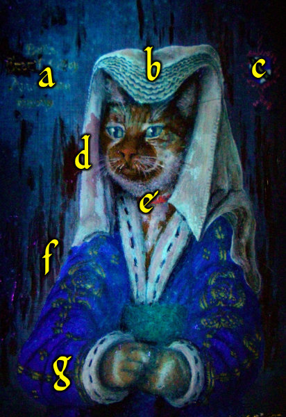
Let's have a look at some normalised UV images. |
 |
 |
| Normal Visible range image |
Normalised UVF image with areas of interest. |
 |
 |
| a). A correction to the lettering - the paint was 'dug' back to the gesso then the layers added again but this time with the wanted lettering. The fluorescing layer that was omitted was the oiling out after the red layer of the wooden background so here, it doesn't fluoresce. |
b). Shading has been lightened slightly with lead flake white which fluoresces differently to the titanium white (both are adulterated by Winsor and Newton with zinc oxide but to different extents - the flake is over 30 years old). |
 |
 |
| c). Look closely and you can see the real rose madder in the red ribbon and tassles fluorescing. |
d). Here, you can see where the painting has been modified and the whiskers have been painted out with the wooden background layers, leaving a non-fluorescing area. Also, on the headdress, areas of pink show where lead white has been used to fine-tune the colour - utilising the fact that it is a softer white and more transparent. |
 |
 |
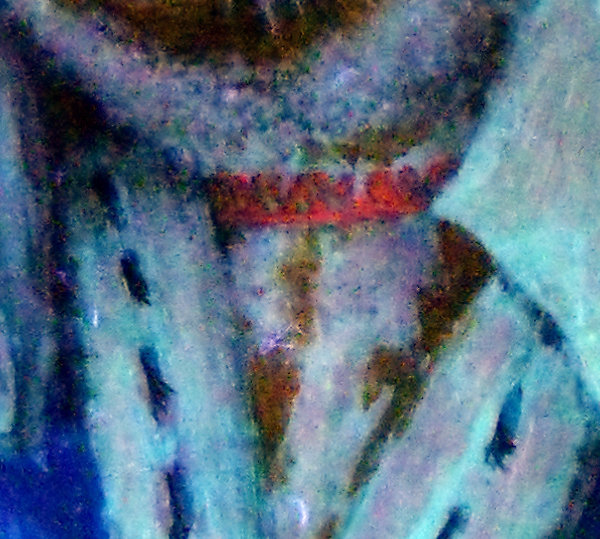
| e). Here you can see where real rose madder has been used on the collar and also where the white of the ermine and white collar has been fine-tuned with lead flake white, showing up as pink. |
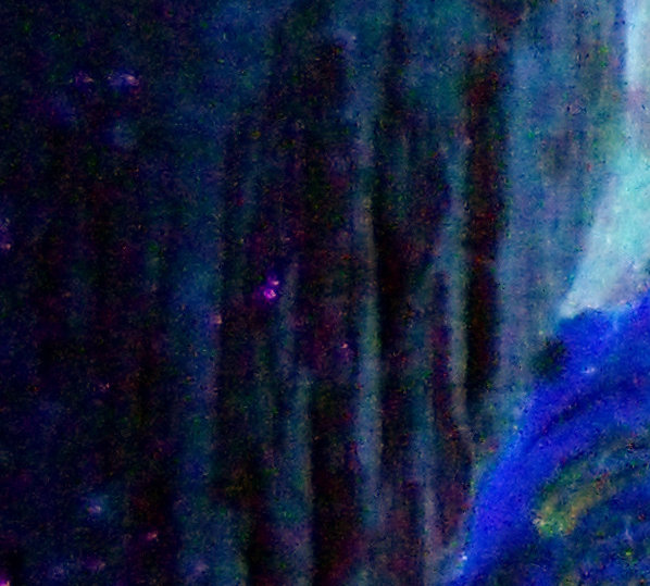
f). Here, you can see horizontal lines showing through the red - non-fluorescing and transparent in UV - which are in the base layer. Also, you can see where black has been used to tone-down the wood so that rings can be painted. |
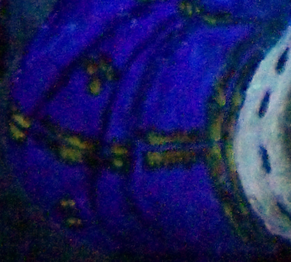 |
g). The blue of the sleeve is painted on an extra, sketched dead layer (just shades of grey, no colour) so the horizontal lines in the layer under that don't show. However, the black that was used to show where the folds in the sleeve are can be seen quite easily - extra shading that is visible to the naked eye being transparent in UV. Also, note that the yellow highlights of the gold brocade show up a lot brighter - this is because they have some titanium white in them (for extra opacity) and a yellow pigment - these not being in the other colours used to make gold.
|
Finally,
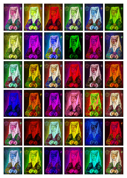
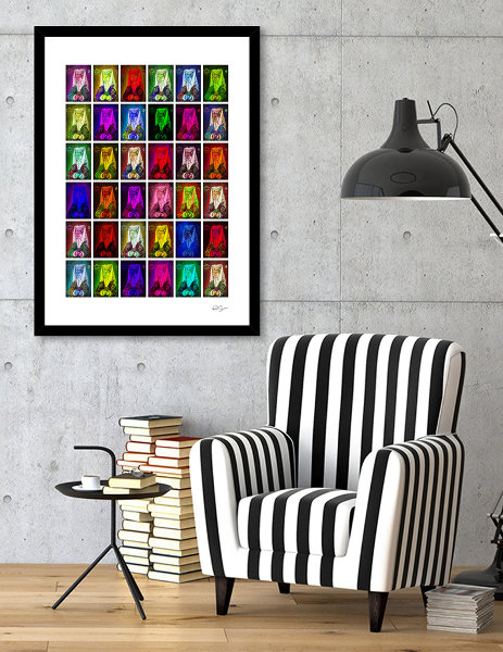
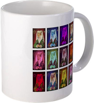
We have seven images - UVF, B, G, GL, R, RL and IR. We also have the ability to rotate the hue at will of any image we make so, with that in mind, it's time to make a design for a tee-shirt or some wall art. |
 |
 |
 |
| You can do this with any image if you have enough ways to vary it. |
If you would like a copy of this one, you can buy it online as one of a limited edition. |
Or, if you want it as a mug, T-shirt and so on, you can buy that here. |
|
All images and original artwork Copyright ©2017 Paul Alan Grosse.
|